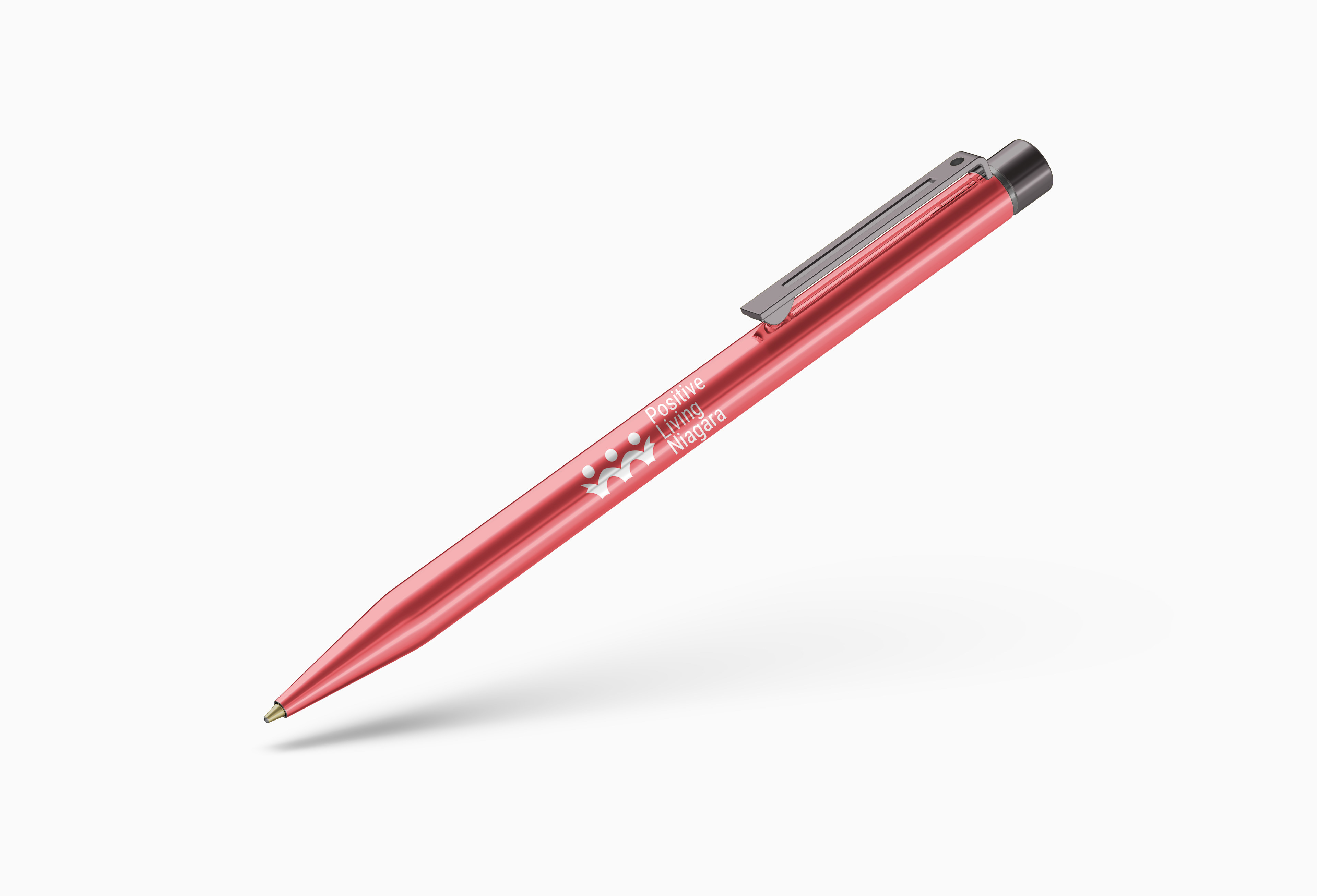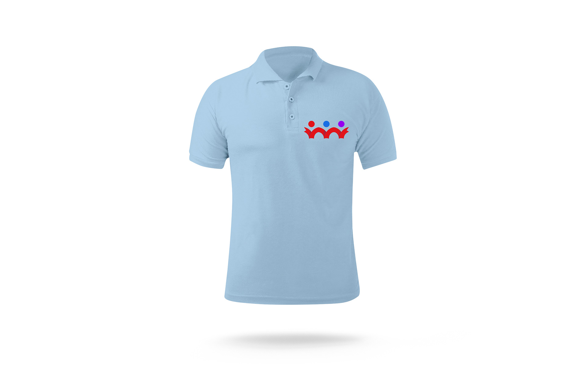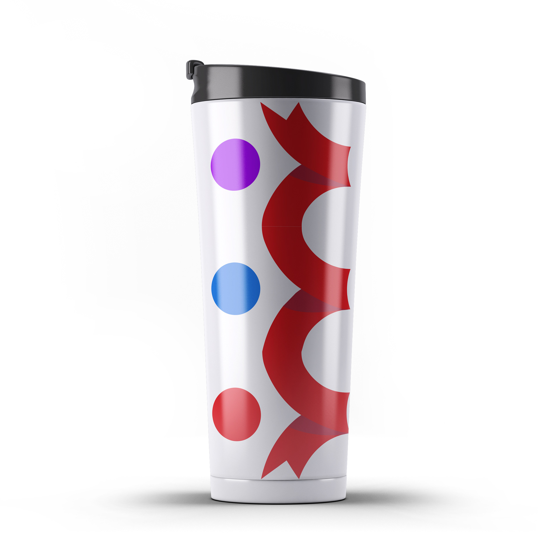


The refreshed logo for Positive Living Niagara incorporates an updated version of the human icon while maintaining the recognizable red ribbon as it symbolizes HIV awareness. The design contains the red ribbon that forms 3 human figures while alluding to the architecture of a bridge, which is meant to demonstrate that Positive Living Niagara is bridging the gap between their services and those in need. The three coloured heads of the human figures each represent an element of Positive Living Niagara’s core values. Red represents education, blue represents acceptance and purple signifies humanity. In addition to the primary identity, a variation of that was created to act as an icon for applications such as social media profiles as well as other instance where the full identity would not be used. This was done so that the brand could be recognizable without needing to have the name of the brand alongside it.
